Playtime Island
I assisted senior designer Robin Gibson in the design and build of a new children’s app that would play HTML 5 Games - Much lighter in file size than its predecessor but also more accessible by being screen readable. Playtime Island is a single purpose gaming app that contains a number of games within it. We decided with the Editorial and product team that a town on an island narrative would work best.
Character design by Robin Gibson and Animation by me.
Defining the problem
We used an animated teaser to illustrate and excite stakeholders to what the initial problem was and how a new more accessible games app could transform our offering to our young CBeebies audience. I animated senior designer Robin Gibson’s lovely characters in the same way we would design for our audience - with delight and moments of surprise.
Lo-fi animated wireframes
We knew from stats from the existing CBeebies Storytime App that a download feature was successful - so for the new Playtime App we looked at how that feature could fit in. By storyboarding and animating wireframes we could user test the idea of ‘factory’ where games were produced and children could select the games they wanted. Results showed that the factory concept was too complicated for our audience. However, it was a great way of getting ideas in front of our audience to challenge assumptions.
Quick low-fi animated wireframes.
Logo Design and Development
I designed Playtime Island’s logo - I started by researching what style of logo might Playtime Island take on? Some competitor analysis and looking what was currently out there - parent brands, game logos and worlds they inhabit.
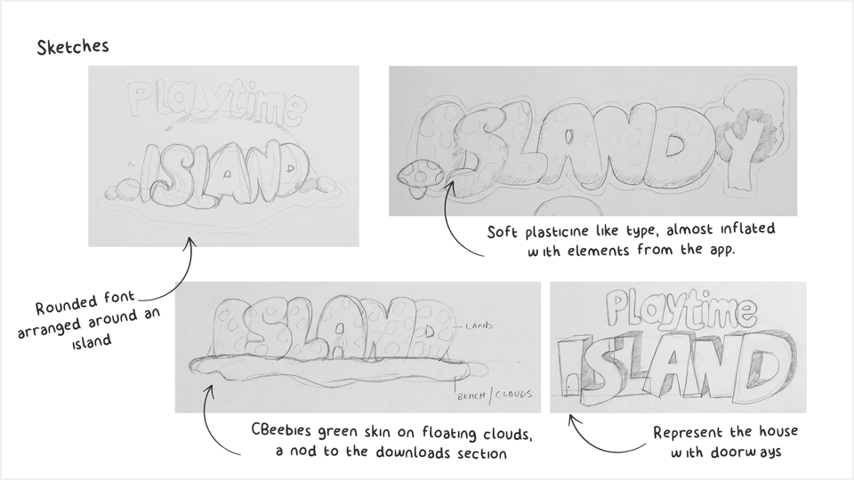
After that there was no better way to explore ideas than getting the pencils out and get scribbling. The design developed as I explored texture and legibility - finding out that young children find it harder to read all capitals.
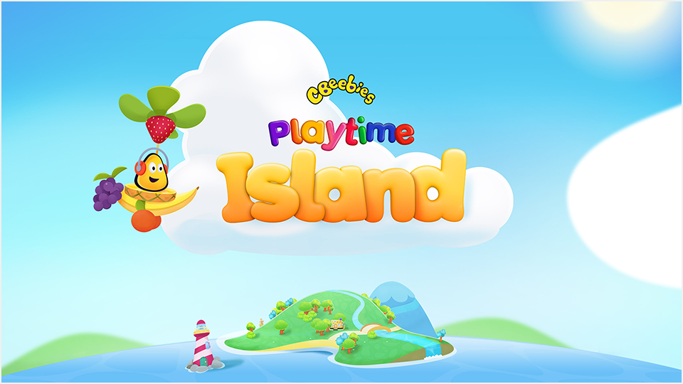
I then created lettering in illustrator and brought it into Cinema 4D, expanding it so it took on a playful look - then taking the render into post production adding colour, texture and light in photoshop.
As a result the new logo sat perfectly amongst Senior designer Robin Gibson’s beautiful Island Illustrations.
Font created in Cinema 4D and post production in Photoshop
Co-creation and House Design
It was really important not to make assumptions and build an app - then user test with children. Getting the children themselves involved in the early stages of the app design was imperative. We visited schools and asked the children how they might travel around the island, what characters there might be and what would the houses of Topsy and Tim - On the Farm or Go Jetters - Cadet Rescue might look like.
The best thing about getting Children to design their app is that we know there wasn’t a chance on earth that we as adults could come up with the wonderful ideas that 5 and 6 years olds had. We took the children’s drawing and thoughts and I developed into Topsy and Tim and Go Jetters houses.
Topsy and Tim on the Farm Game House
How the Topsy and Tim House appeared on Playtime Island


